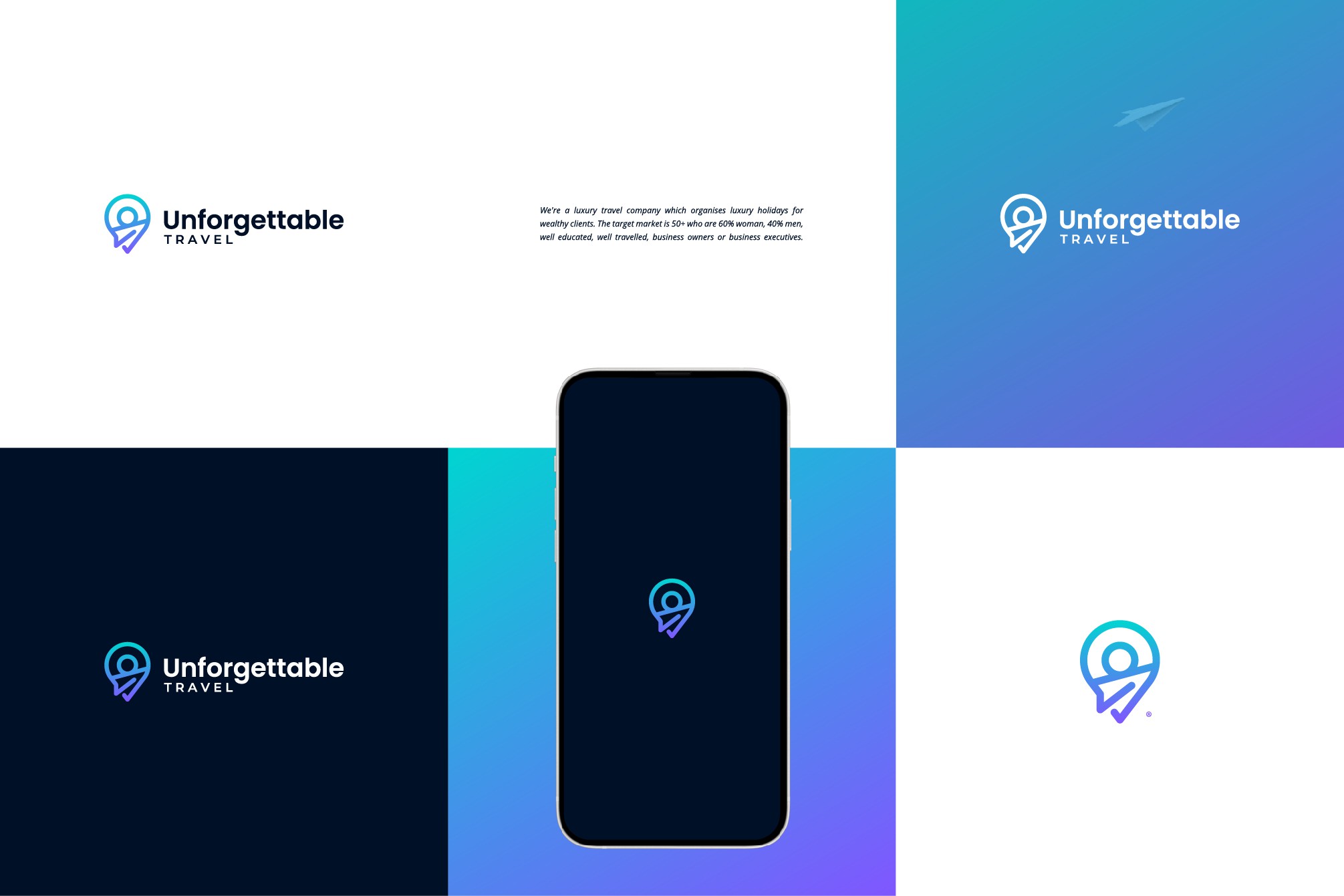
Modern Logo Design for Luxury Travel Company

19
Kreiert mit 99designs von Vista
This was a rebrand and their old and outdated logo had a very "clip-art" style design incorporating a pinpoint and paper plain icons. I used this two icons to create a more modern and fresh design combining a paper plane icon and a sun/circle shape to form a unique pinpoint symbol.