Halloween-themed event badge

1
Kreiert mit 99designs von Vista
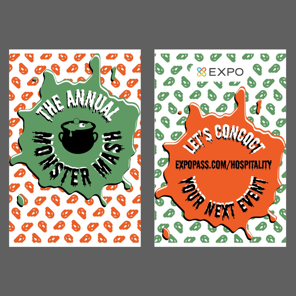
Another four spot colour design, featuring green instead of blue. This went better with the central theme of a witch's brew. This is also supported by the central graphic, splats and slimy typography. I also used a pattern of ghosts that subtly echo the Expo Pass logo.