Country Band Logo

3
Kreiert mit 99designs von Vista
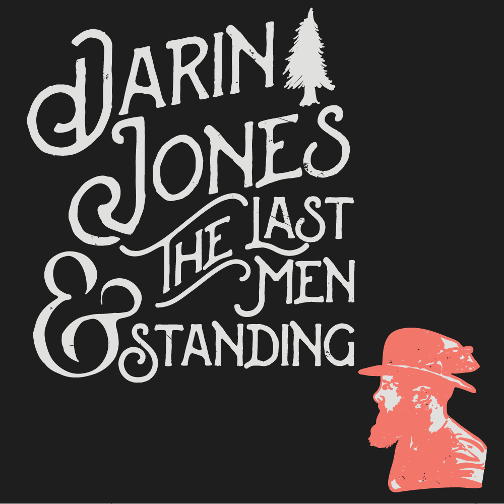
I started this design with the stacked wordmark design. Working with 3 vintage typefaces I picked and merged the qualities that worked best for each word/letter. Then I positioned the layout to give it that rising and stacked appeal. For the wordmark, my final step was to get all the textures and weights to work well together. Next I worked on the character mark and tree icon. Using Adobe draw to give both the same vector hand-drawn sketch look.