Ostone Tech logo and business card

68
Kreiert mit 99designs von Vista
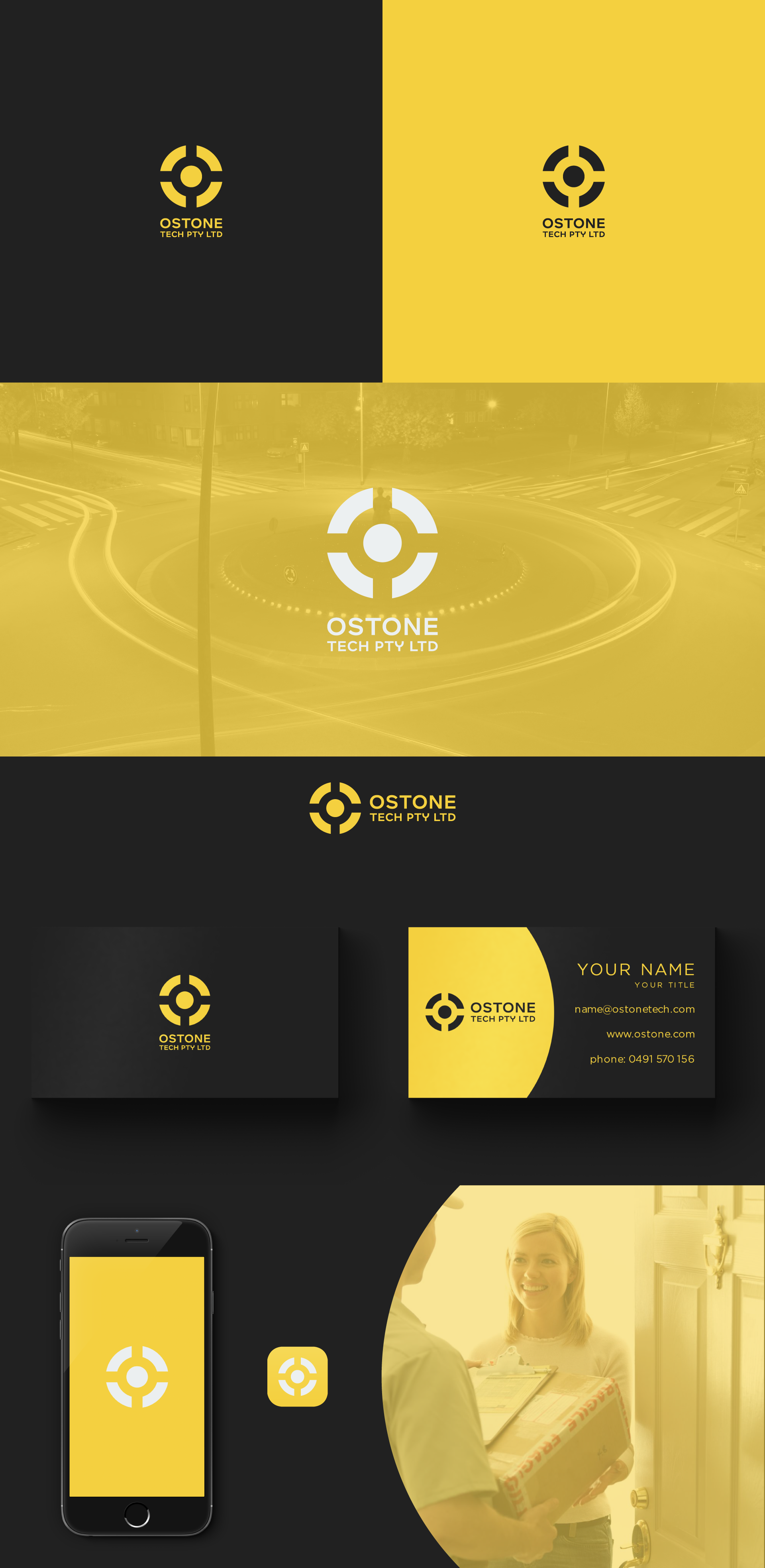
My aim was to create a modern and simple design that also have some hidden meaning.
So, for the logo simbol I have created an "O" letter stylized to symbolise the traffic circle. With that I wanted to send a message to the customers that Ostone makes deliveries in all directions, no matter what.