Sweet Crates - elegant bakery take-on

2
Kreiert mit 99designs von Vista
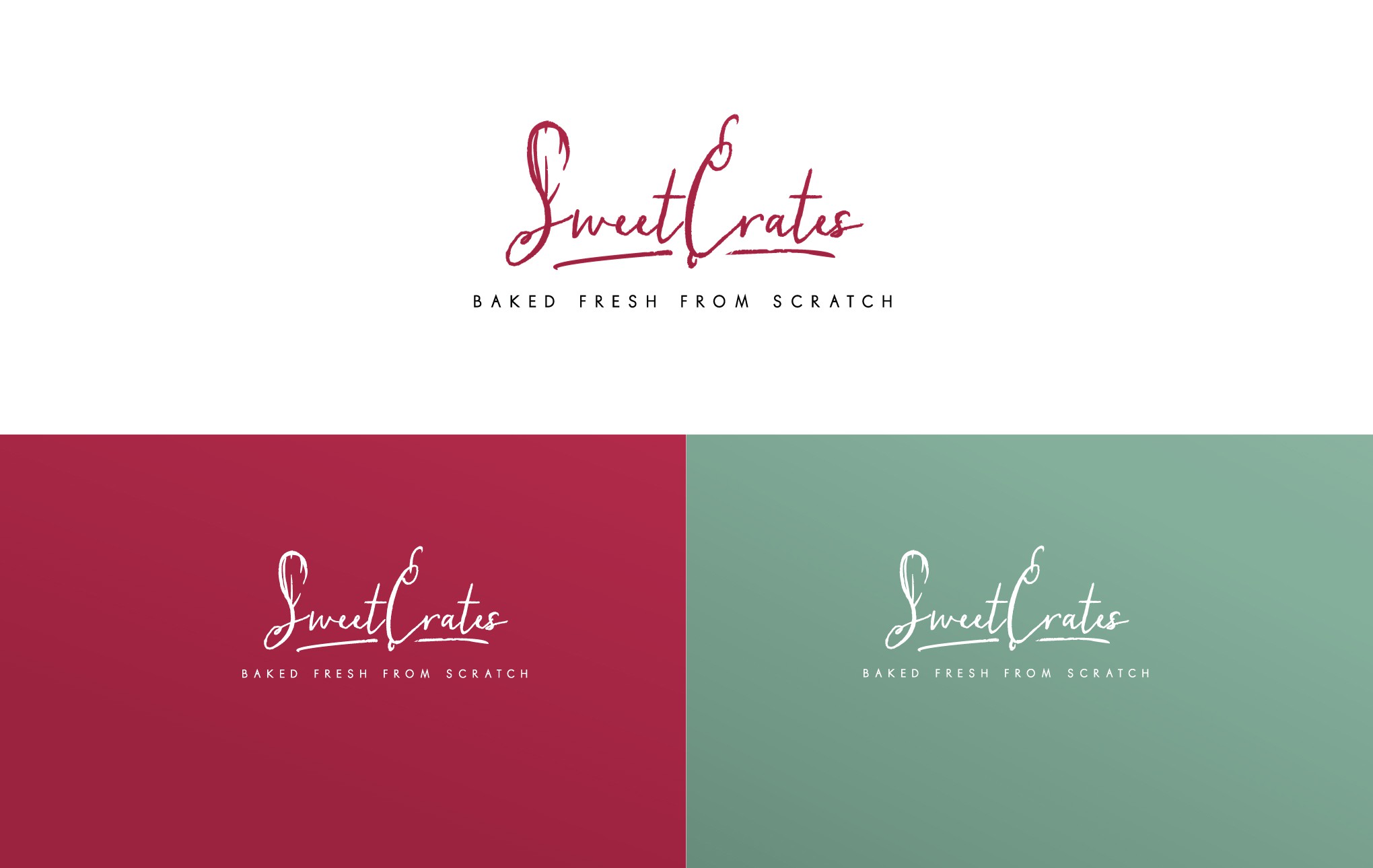
A handwritten cursive font was all I needed to spot the some interesting shapes that emerge. The "S" in sweet suddenly seemed like a good frame for a mixer and the "C" in crates a rolling pin. It was too artsy for the client and I agree, yet I can't seem to dislike the approach.