Logo for small business for back of shirts, beer coozies, sponsorships for fishing tournaments.
 von DAROSE
1
Kreiert mit 99designs von Vista
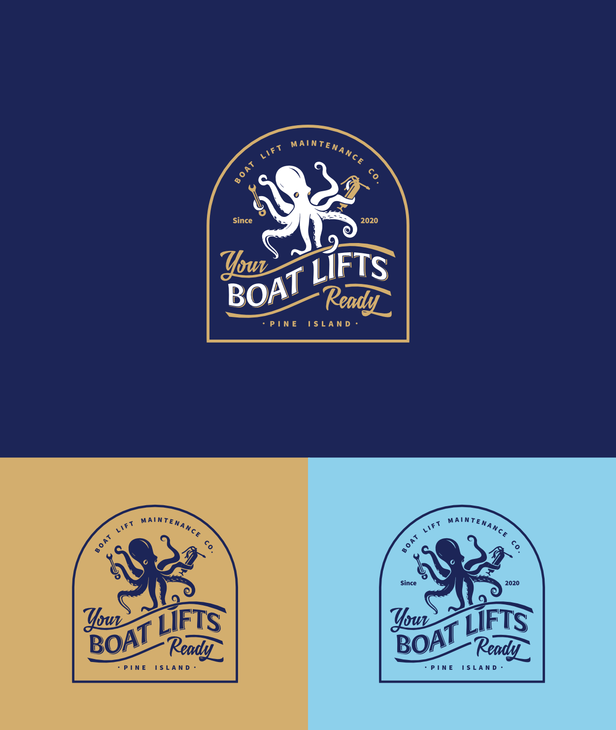
I crafted this logo based on the client's unique vision. They wanted an octopus to symbolize lifting and rescuing boats, which I brought to life through a white octopus wielding maintenance tools. The design merges nautical charm with mechanical expertise, featuring the octopus centrally on a navy background. I incorporated vintage-inspired typography and a circular emblem to evoke a timeless, maritime feel. The result is a distinctive logo that tells the story of a boat lift maintenance company ready to lend its many "arms" to keep watercraft afloat and well-maintained.