
Kreiert mit 99designs von Vista
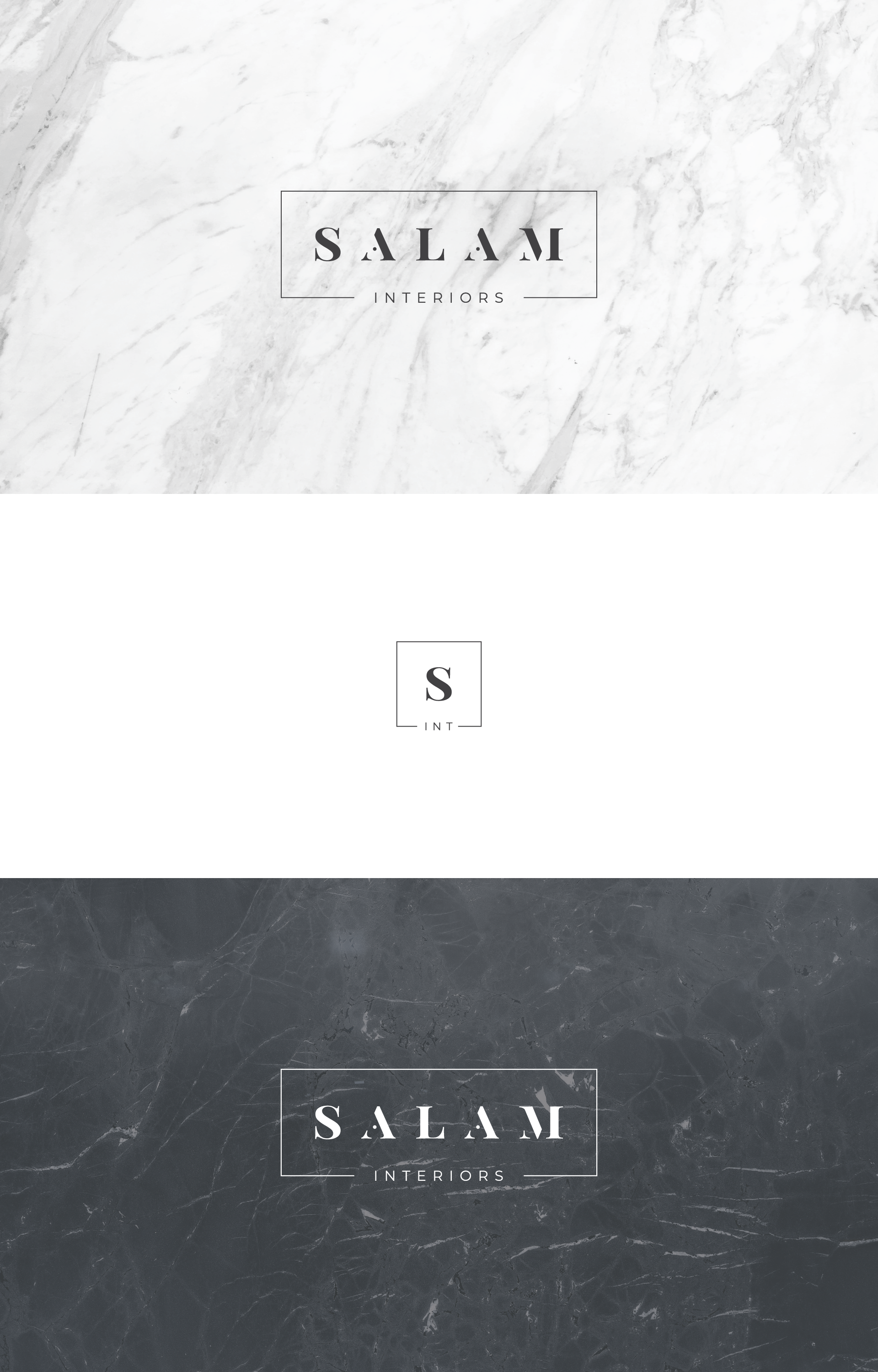
This is a very bold and classy version of the old logo of the contest. I wanted to play with some shapes (the points on the "a"s) to achieve a very unique and sutil touch.
I proposed to use textures more than just solid colors. This will give the brand a professional and dynamic look.