Be-One Organics Logo

2
Kreiert mit 99designs von Vista
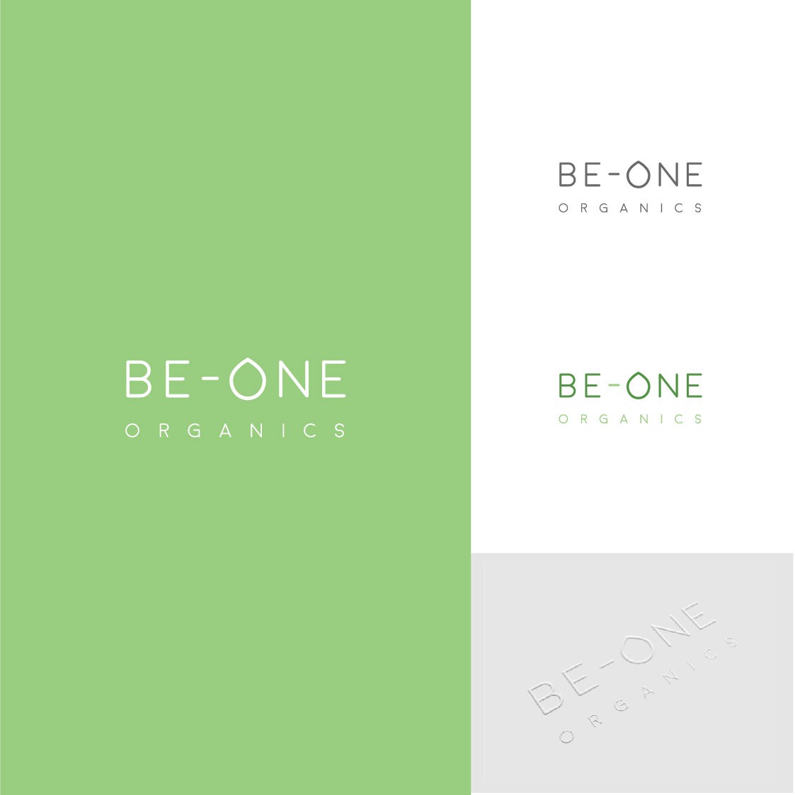
The organic and purity of the brand identity is communicated through the clean, sans-serif typeface and emphasised with the use of a muted green palette to imply natural and organic products. The versatility of the logotype design means the 'o' droplet shape can be used as a visual device throughout the branding as a small, subtle nod to the logo where it's full logo isn't shown. The embossed mockup (bottom right image) further communicates the organic look and feel with an elegant and simplified finish that sits well on light tones.