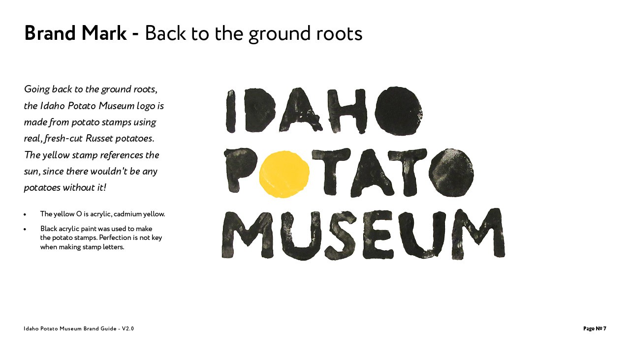

In this project I worked with the client to create a fresh new brand that appealed to local residents as well as tourists who pass by. The logo was created through multiple rounds of paper and digital sketches until the current one was produced. Multiple directions were approached, but experimentation not only gave the logo its unique texture, but it also brought the brand back to its ground roots. Using real potatoes and paint, I carved out the letters, stamped them on paper, and later touched up the logo in Photoshop.