Pipette Natural Skincare Line

1
Kreiert mit 99designs von Vista
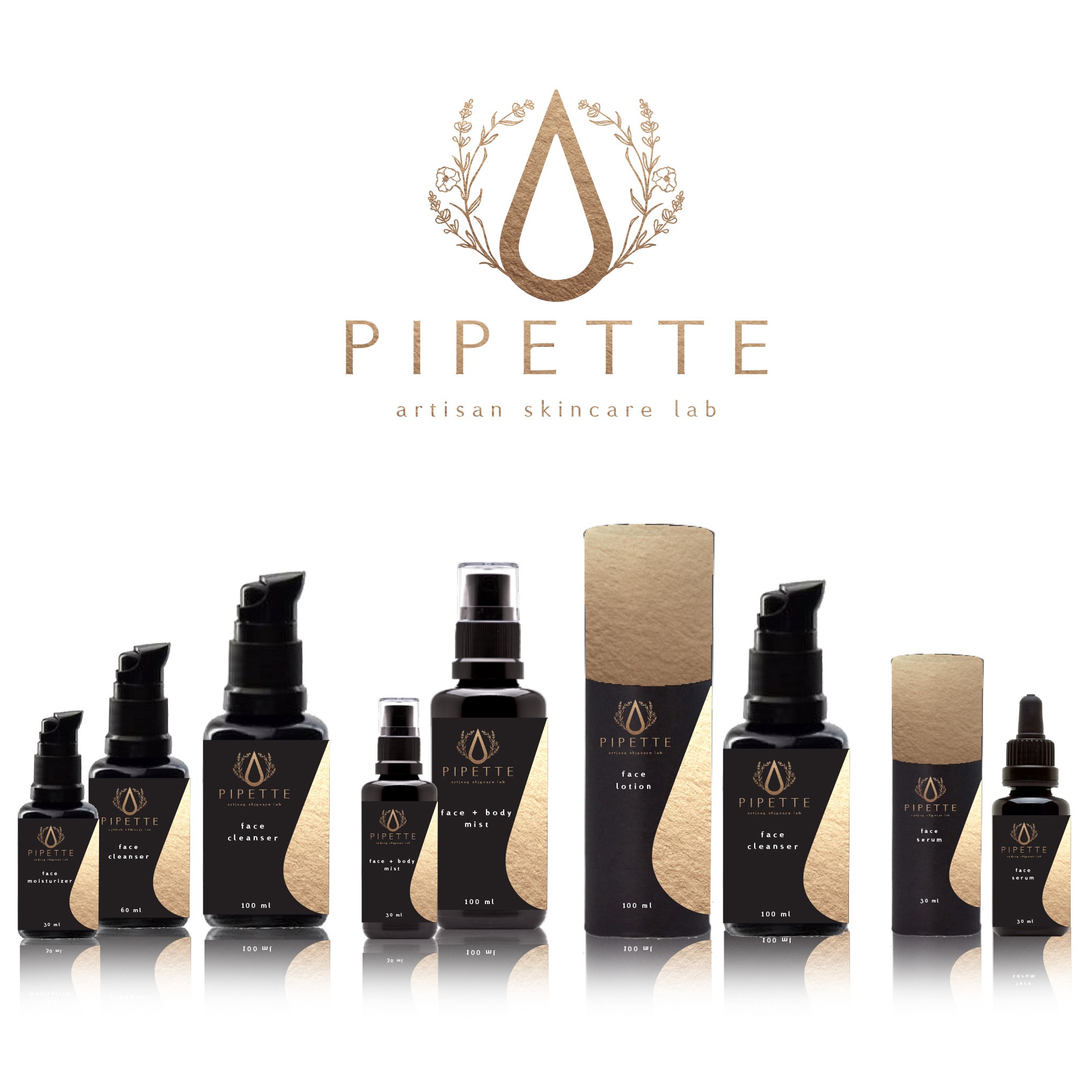
I used the gold logo look for this layout. All areas with gold will be gold metallic, either ink or gold foil.
I like the idea of a tube packaging to hold the bottles. The top would be be gold and the bottom would be a rich black.
The bottle labels would be clear or black with the gold metallic ink or gold foil.
I used the drop graphic from the logo as a design element on the right of the labels and tubes as I think it is a perfect element to add interest and depth, especially being treated with the gold ink or foil.