Logo for a Naturopath

0
Kreiert mit 99designs von Vista
Clean. Simple. Memorable.
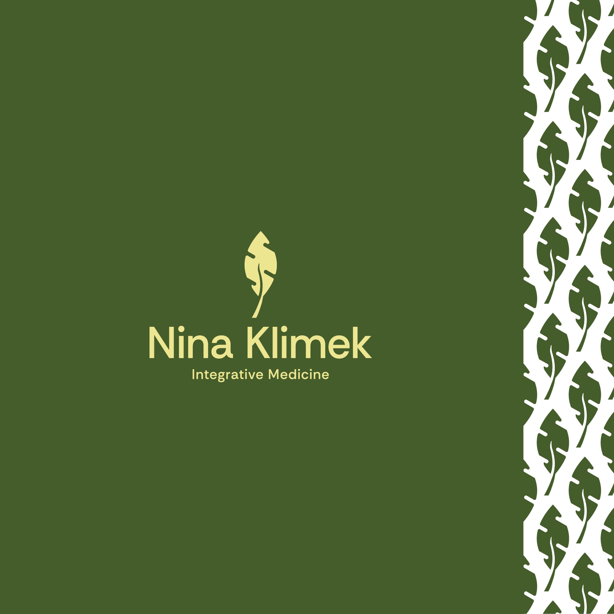
This is an organic design because it's a combination of two things. A leaf and the matrix of the mitochondrion which is something the client asked to incorporate into the mark..
The colors also make it feel natural.
Typography is simple and very easy to absorb. I've chosen a sans serif as these types of fonts are easy to read (even at business card scale). Legibility and readability have been taken into account.
I've also included a pattern of the mark.